
Maclean’s website gets responsive design makeover
This tile-based responsive design has been rolled out across all Rogers’ consumer magazines—including Chatelaine, Flare, Canadian Business, MoneySense and L’Actualité—over the past two years, with Maclean’s being one of the last magazines to be redesigned.

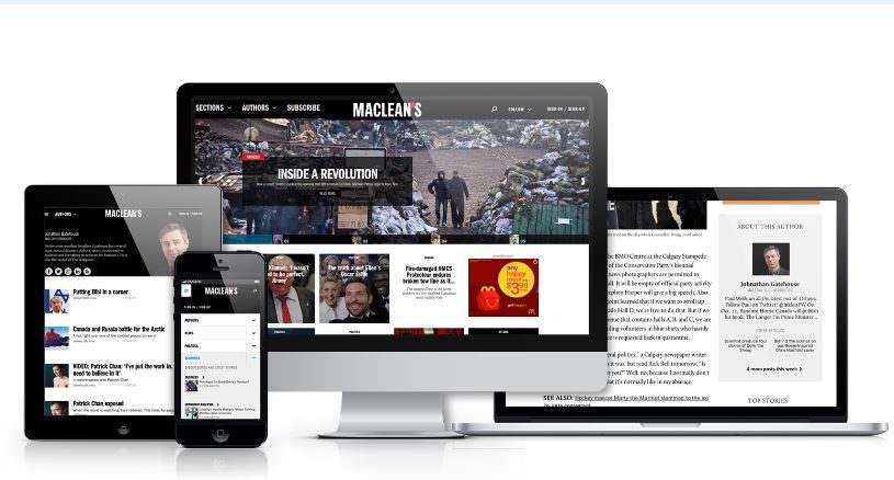
The redesigned Maclean's website. All photos courtesy of Rogers Media
By Tamara Baluja, Associate Editor
Maclean’s redesigned website has a new tile-based responsive design.
The new website—which now automatically configures its size depending on whether the viewer is on a desktop, smartphone or tablet—has an easier navigation, a cleaner look and larger photographs.
Sue Allan, managing editor of digital, said the redesigned website was inspired by a need to better showcase the work being done by Maclean’s. “We wanted to break down that distinction between work that was produced for the weekly magazine and the daily file,” she told J-Source.
Related content on J-Source:
- Rogers appoints new group publishers for current affairs and business magazines
- ROB editor Derek DeCloet leaves Globe for Rogers
- 5 lessons from CSME's new editors panel

As a result, the clunky blogs hub—Blog Central—is now gone, replaced by a drop-down menu that lets readers sort by author and section. Articles are now arranged in large tiles, and every article on the home page is accompanied with a visual.
This tile-based responsive design layout has been rolled out across all Rogers’ consumer magazines—including Chatelaine, Flare, Canadian Business, MoneySense and L’Actualité—over the past two years, with Maclean’s being one of the last magazines to be redesigned.
Ryan Trotman, senior director and digital publisher of Rogers Publishing, said the responsive design delivers on a promise to readers to be available on all platforms. He wouldn’t disclose how much the company invested in the project, but said with the company’s shared resources, the redesign cost less than it would have for a comparable independent magazine.
Trotman said content is not curated or edited differently for the various platforms.
“I don’t necessarily subscribe to the idea that readers want to read different edited content on the mobile desktop,” he told J-Source. “We’ll deliver the consistent approach and good content everywhere.”
Since November 2012, pageviews on the redesigned website have increased about 35 per cent on the desktop and 63 per cent on mobile for all Rogers magazines. Overall traffic is now almost equally divided between mobile and desktop users.
Trotman said the responsive design has proven popular with readers, but engagement is highest on the iPad version of the magazines. On the app version, Trotman said readers don’t visit as often—usually weekly or monthly depending on the magazine’s publishing cycle. But when they do, they read more pages and are more likely to read cover-to-cover. “It’s a more traditional linear experience … exactly what you would do if you had the magazine in your hands,” he said.
However, website users, whether that’s on a mobile browser or desktop, are more likely to visit the site several times a month, but only read a few articles a time.
Looking ahead, Trotman said he wants to make a bigger push in the online video space. “Part of that means better synergies with our broadcast elements.”
Related content on J-Source:
- Briarpatch takes legal action over access-to-information requests
- 5 neat things about The Globe and Mail’s Olympics site
- How well are Canadian newspapers doing with paywalls, tablets?
Tamara Baluja is an award-winning journalist with CBC Vancouver and the 2018 Michener-Deacon fellow for journalism education. She was the associate editor for J-Source from 2013-2014.