

Independent journalist and author Nora Loreto has been collecting COVID-19 mortality data since around mid-April, 2020. Through daily tracking — scanning media reports and obituaries across the country — the Quebec-based researcher found a staggering number of deaths in residential care early on.
Then, she started gathering data about workplace-related cases, which she describes as a “black hole” in our understanding of COVID-19.
“I think, especially on the workplace piece, that has been … my biggest frustration with public health (bodies), is that we’re just not hearing which workplaces are having outbreaks,” she said, though she credits some provinces, including Alberta and Saskatchewan, for having better information on workplace outbreaks than others.
According to Loreto, this reality has left us with a very murky picture about the dangers of different workplaces.
“We literally do not know what the most deadly industries were,” she said. “We have an idea; through my own research, I can say it was transit and meatpacking. Meatpacking obviously made a lot of headline news, but that’s it.”
The pandemic may be the most significant period for data journalism in history. The now-ubiquitous expression “flattening the curve” is inherently a numerical concept but it also relies on visualizing numbers on an X and Y axis so that people can actually see the curve and whether it’s going up, down or remaining relatively flat.
Across wildly disparate public health reporting frameworks and rapidly changing local contexts, independent and newsroom journalists have been delivering data in digestible formats for audiences to access critical information in their communities. Data has taken centre stage in everything from daily social media case-count updates to large newspaper investigations. Health-focused online magazine The Local has created interactive maps showing vaccine access and outbreak hotspots, and recently launched its School Tracker — a live visualization depicting outbreaks in Toronto’s public schools.
“I would say that this is the first global crisis in which visualization is … at the forefront of journalism,” said Albert Cairo, Knight Chair in Visual Journalism at the School of Communication of the University of Miami.
Part of that need has arisen from government failures to provide clear, comparable information.
It’s an inconsistency pointed to by Loreto, whose book Spin Doctors: How Media and Politicians Misdiagnosed the COVID-19 Pandemic is coming out this fall.
“The fact that every province’s data regime is different, and that there was no directive from the federal government to collect certain kinds of data that easily could have been imposed through various kinds of legislation, just kind of demonstrates how much of a lack of priority it really was.”
For many journalists, the pandemic has been a crash course in data, not just in terms of sorting, aggregating and calculating numbers, but also in terms of understanding the limits and gaps in the data and conveying the uncertainty to people.
As Cairo wrote in his book How Charts Lie, “data is often uncertain, and this uncertainty should be disclosed. Ignoring it may lead to faulty reasoning.”
Brishti Basu, a journalist with Capital Daily in Victoria, has been tracking COVID-19 data since the start of the pandemic. But she has been frustrated with the many gaps in reported data coming from her province.
“Consistent data about variants of concern and how they’re spreading in B.C. is really difficult to get,” she said. “In B.C., they only released information about how many cases are which variants once a week. And even that report … is often inaccurate because it’s preliminary data so they’ll correct it later on in the next week. So there hasn’t ever really been a time when B.C. has released full, complete, (current) data about variants of concern, which has made it really difficult for journalists, as well as independent experts, to analyze how, for example, Delta is spreading in the province right now.”
Basu has also found it challenging to fill in the many gaps around data that gets reported about COVID-19.
“In particular, my interest has been looking at how racialized communities have been impacted by the pandemic. And in B.C. … they don’t collect race-based data on COVID-19,” she said.
”So the kind of process has been looking at community health service areas with the highest COVID case rates per 100,000 population and then narrowing it down by looking at the racial demographics of these neighborhoods, kind of like piecing together the puzzle that way.”
According to Basu, this has been time-consuming work that involves combing through census data for different neighbourhoods that have those higher case rates. This method involves certain inferences and so will have some margin for error, but in the absence of race-based data there are few options. Basu, who does not consider herself to be a data journalist, says she may only see the location of the cases in PowerPoint slides from provincial health bodies, not from raw data.
Numbers have to be gathered, sorted and analyzed before they can be visualized. The numbers may also be shrouded in uncertainty. This has presented journalists with some major challenges.
In the first weeks of the pandemic, Toronto Star editor Ed Tubb was collecting numbers every day in a Google Sheet from all of Ontario’s health units. In part this was out of necessity, because the provincial government was not yet publishing data each day. But it was also strategic.
“Those are the people who are actually doing the primary data gathering,” said Tubb, referring to the local health units. “So even the numbers coming from the province or coming from the feds, all of those numbers are being gathered and tabulated by the local sources.”
Tubb recalls that in March 2020, he would notice that the number of reported deaths in any given health unit might be higher than the total provincial number reported, indicating that there were gaps or anomalies in the provincial-level reporting.
Before the pandemic was declared, Tubb wasn’t a data journalist at the Star. His day job was as an assignment editor in courts and crime. (Full disclosure: I spent about 14 years in a variety of roles at the Star but I never overlapped with Tubb.)
Although Tubb describes his spreadsheet skills as on the “upper end” of what he thinks is typical for journalists, his database was not particularly complicated.
“Anyone who knows how to use Excel quite well would be able to reverse engineer some of the stuff I’m doing. It’s got a lot of SUMIF formulas, a lot of COUNTIF formulas. Nothing complicated, no advanced math,” he said.
Part of the challenge with the local and provincial data, for those not steeped in data work, is that it is not aggregated. That is, the data doesn’t provide a number of confirmed positive cases in each health unit each day, for example. Instead, the data contains multiple rows, each one of which represents a confirmed case, or a test result or other measure. On May 15, 2020, the spreadsheet of confirmed positive cases throughout Ontario contained 21,922 rows. By Aug. 1, 2021, that number had grown to nearly 550,000. Each day, Tubb and other journalists need to count the rows and filter by health unit or gender or age group, etc.
“I’m not doing statistical significance or any of that kind of stuff, because I don’t think I need to. And really, at the end of the day, I’m trying to present data in a way that is easy for a lay person to understand.”
This work has allowed Tubb to produce graphics regularly for the Star and on his Twitter feed, showing trends in positive cases, seven-day averages, test-positivity rates and more.
Overall, Tubb thinks Canadian journalists have worked effectively with the data but he says there has been some tension between how the data is managed and some of the journalistic imperatives. Take, for example, the reporting around daily test positivity numbers.
“What I’ve struggled with through the (pandemic) is watching a lot of tweets, a lot of journalists who are less steeped in this stuff, seeing big numbers and saying ‘Oh, this is a big jump today; we’ve had a big spike today because Ontario recorded 3,000 cases, and we put it in breaking news,’” he said.
“We’ve seen over and over again that any one day’s number can be influenced by a data dump in Toronto or maybe some other health unit [which may have] failed to complete their upload in time.”
“So on the one hand, I feel like maybe there’s a bit of a lack of discipline and savvy on how to present data. And we’ve tended to focus too much on the moment, rather than the trends at times.”
Naël Shiab has also thought about the relation between journalism conventions and the uncertainty around the data.
“The news style of reporting is very much saying ‘here’s what happened, and it’s true, we have documentation, or we have proof that this happened and trust us.’ But with data analysis, the data is messy,” said Shiab, a data journalist at Radio Canada/CBC who helped develop one of the broadcaster’s national COVID-19 dashboards .
“I think there are some improvements that I could have made because everything happened so fast,” he said, reflecting on the early months of the pandemic.
“The government gave us a very precise number on how many people are infected. But very quickly, a question arose: Are we under testing? Do we really know how many people? It’s almost like the census, right? When we say ‘there is this exact number of people living in Canada,’ do we really know these exact numbers? No, of course, there’s a certain margin of precision.”
This lead Shiab to make many different additions to the COVID-19 dashboard over time, including testing rates per capita, hospitalizations and other measures. He and his team also include descriptions of the methods they use and notes about the different ways in which the data is gathered.
But Shiab has also struggled with different ways of displaying the data. For example, the dashboard can display the data on a logarithmic scale. But he received a lot of emails from people asking what a log scale was.
“If you’re an expert, or if you know what a log scale is, you have that option if you think this is the best way for you to look at it. But our default view is a linear scale of daily cases. And you have the cumulative numbers in a table. Very simple.”
Simple to look at perhaps, but no simple matter to develop. Shiab is part of a team that has two developers and two designers. Shiab himself mostly uses Python for data analysis and Javascript for visualization.
Shiab says that for a typical data story, journalists get the data and documents, crunch the numbers, talk to people and then they produce a story or multiple stories. But with COVID-19, not only is the data coming from many different sources, collected in different ways and distributed in different formats, it changes every day or even every hour.
“And also, there are big expectations from the public regarding this data and big responsibilities for the reporters, because we’re talking about something that if you catch it, it could make you very sick or could even kill you.”
And obviously the COVID-19 picture is not static.
“People want to know the most up-to-date numbers [so] you have to produce a project that will be able to update itself.”
There are also many different ways of presenting the data visually. Aside from decisions about whether to show numbers on a linear vs. log scale, do you present numbers using a map, either using different sized bubbles to represent the numbers from each province, for example, versus using colour density from each province or territory, usually referred to as a choropleth map?
The famous dashboard from Johns Hopkins has, more or less from the beginning of the pandemic, used sized bubbles to differentiate between numbers in different regions in the world. Cairo said this can be problematic, though he prefaces his comments by saying that overall the dashboard is “great work.”
“It shows you, for instance, one bubble per country in Europe. But in the case of the United States, it’s one bubble per county. So there are thousands of bubbles in the United States. And in the case of Canada, it’s one bubble per province. That’s a problem because you’re showing different levels of aggregation of the data.”
In other words, when one dot in the U.S. represents Miami-Dade county and a dot on the other side of the Atlantic represents the whole country of France, one number is shown at a much more local level than the other.
Choropleth maps, like the one used on the federal government dashboard, also have potential problems. For one thing, the shades of blue representing Ontario and Quebec can be difficult to distinguish, even though the difference between the total numbers in the two provinces is large: 368,463 for Quebec; and 526,045 for Ontario. These numbers are also just totals.
There are many other choices even around something as seemingly straight-forward as a bar chart. One CBC graphic, for example, shows a bar for each day along the X axis with the number of newly reported cases in Ottawa on the Y axis (along with a red line for the seven-day average of cases per 100,000 population).
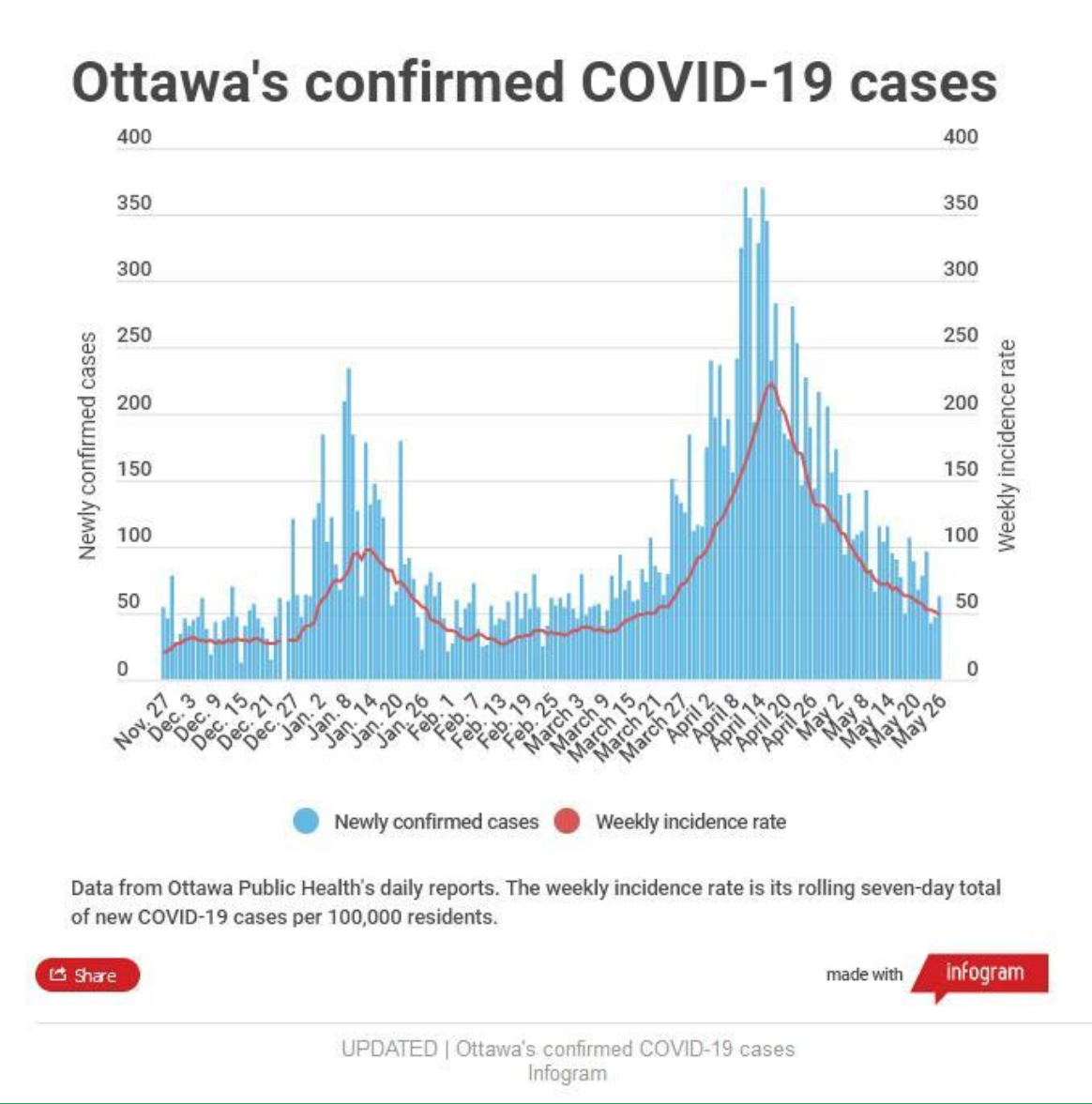
But each bar represents the date when cases were reported to the media, not the date on which the cases were confirmed. This isn’t necessarily a problem, as long as readers understand the context and that numbers may appear to diverge from official sources.
For example, the CBC graphic shows there were 156 newly confirmed cases on May 1. But Ottawa Public Health data shows that there were 137, because its data represents the date on which the case was reported to OPH and it can take a couple days for the number of cases to be accurately attributed to a date. (And even this depends on testing numbers, because no case is confirmed without a test.)
This illustrates the importance of having annotations attached to visualized data.
“It’s so important to add what we call an annotation layer, being extremely explicit, telling readers what the chart is actually showing and what the chart is not showing,” said Cairo.
He points to the Financial Times graphics as good examples.
“That is all important because this is very relevant to show readers that data is never certain, that data is always temporary.”
Shiab’s Radio Canada dashboard, for example, includes many annotation notes and a description of the methodology.
Over the first year or so of the pandemic, Tubb says he thinks journalists got a lot better at handling COVID-19 data. And it helps that, at least in Ontario, the public data has improved.
“It’s just taken a while, like anyone else,” said Tubb. “They were kind of caught off guard at the start. And they didn’t have great public data. But now they’ve got better public data than I think almost anyone.”
But those who have been working with the data are also careful to acknowledge that there is still a lot we don’t know about COVID-19 and its true impacts, even as Canada rides into a fourth wave.
As Loreto argued recently in the Washington Post, we also don’t have a good picture of how many people contracted COVID-19 in hospitals and how many of them died as a result.
The issue of how many people in Canada (and elsewhere) have actually died of COVID-19 is another information gap and highlights the disparities in data collection across Canada. Loreto is named as co-author of a recent Royal Society of Canada report, which she says is largely because the report used her data. The report suggests that the number of COVID-19 deaths is much higher than the official number.
The discrepancies bear out the importance of a data-literate news media.
Cairo says that a lot of important skills around data start with basic math skills, which have become increasingly important in the past year and a half.
“It’s not that I’m advocating for journalists to become statisticians – I’m not a statistician,” he said.
“But if you don’t know how to calculate a percentage change or if you don’t know how to calculate a rate … you cannot be a journalist,” he said.
“Because that’s the equivalent of not knowing how to write.”